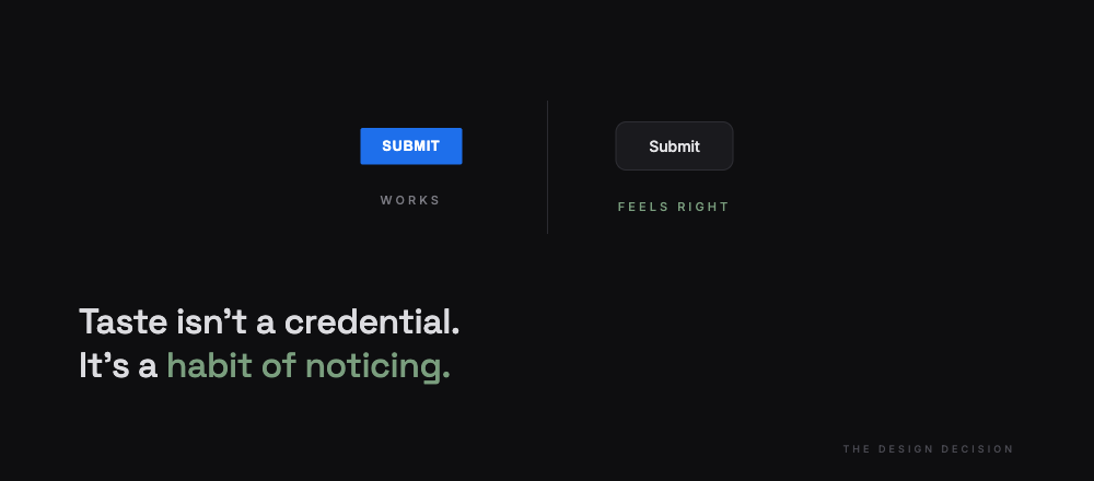
It works. Something about it feels wrong.
The form submits. The API responds. The green checkmark appears where it should. Tests pass. Clicking the button still feels cheap.
This isn't a bug anyone can file.
Solo means the designer hat comes next. No Figma handoff. No design system. No senior designer to weigh in. Just taste, whatever that is, and the uncomfortable knowledge that credentials were never issued.
Then the decisions start.
Button: sharp corners or rounded?
Error text: red or gray?
Spacing: 16 or 24?
Copy: "Done" or "Save" or "Submit"?
Each decision is small. Nobody tests them. Nobody files tickets about them. Most users never consciously notice. The feel is the sum of every one.
The gap between "works" and "feels right" doesn't close through more features. It closes through staring at spacing.
The designer hat demands a different kind of attention. Looking at the same button for twenty minutes until something shifts. Most treat this as overhead. The ones who ship things people come back to treat it as the work.
Taste isn't a credential. It's a habit of noticing.
The engineer hat ships what passes tests.
The designer hat ships what passes a feeling.
Nobody issues certification for the second one.
The users who stay are the certification.